Vexing vexillology – designing New Zealand’s flag
5th September 2015
The New Zealand flag debate is running rife on TV, in the press and across social media. Prime Minister John Key and the 12-strong Flag Consideration Panel are resolute that their decision on the shortlisted four designs is final. Mike Hosking has upset the RSA with his comments live on Seven Sharp. New Zealand Rugby Union have said ‘hands off our trademarked silver fern.’ And the public are feeling disgruntled – first of all with the cost of this exercise (NZ$26 million), when many believe the money could be better spent on more important matters – and now with the lack of variety in the shortlist of four designs and the shortcomings of the selection process.
Putting the cost issue aside (this is a design blog, not a political commentary), what is it that has everyone up in arms? As a professional designer, it feels like the process is leaving the public feeling a little short changed.
To begin with, the Flag Consideration Process looked fair and democratic. Submissions would be accepted from anyone who wanted to have a go. There was no limit to the number of entries each person could make and there was no cost attached. A final submission deadline was given, along with some guidance on flag proportions, flag history and a list of do’s and dont’s.
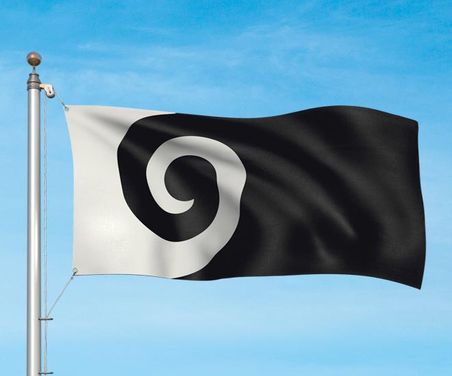
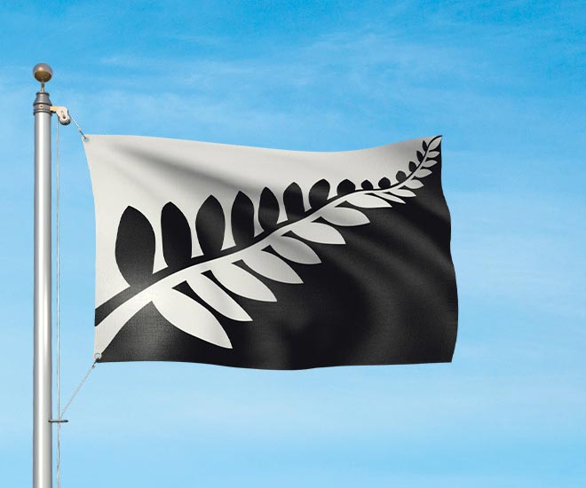
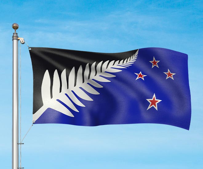
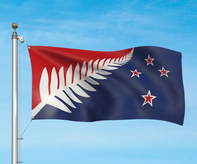
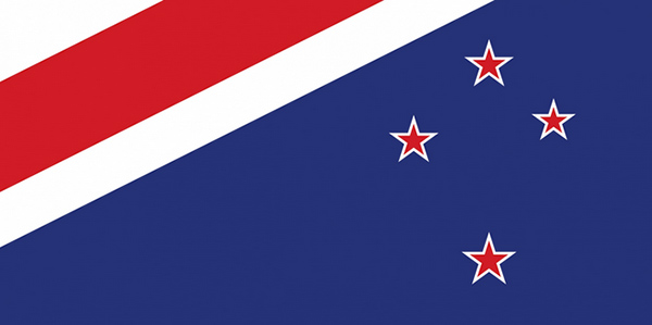
10,292 designs were submitted, which the Flag Consideration Panel swiftly reduced to create The Long List of 39 designs. The Long list has recently been reduced to just four designs for New Zealand to rank in the first binding postal referendum between 20 November and 11 December this year. These are shown below:
So what’s the problem?
The problems started with the announcement of ‘The Four Alternatives.’ Three designs feature a silver fern emblem but two of these three designs are identical apart form a change in colour and the fourth a monochrome koru. So in effect there are only two options – the fern or the koru. However transparent the selection process actually was, it now feels like a hidden agenda was present and social media channels are buzzing with negativity.
As a branding professional, I believe the problem is compounded by two further issues:
- No clear design brief was provided to guide people’s submissions and against which the submissions could be evaluated, so the selection criteria just weren’t evident. This meant that creatively the project was left wide open and subjective.
- There isn’t a design professional on the Flag Consideration Panel and this country has many that could have lent some expertise and balance to the process.
Simplified Blue Ensign
When the project was launched, I was initially really keen to get stuck into this and submit some designs. What I decided pretty quickly though was that this would become controversial for the above reasons, so I submitted only one entry. It was worth a shot and only a small time commitment but nothing more. Sad but true. My ‘Simplified Blue Ensign’ entry read as follows:
Simplified Blue Ensign
Designed by: Rob Holloway from Auckland
I have simplified the current New Zealand Blue Ensign to create a more contemporary flag. The Southern Cross has been retained in its original form and position but the Union Jack component has been simplified down to diagonal red and white panels on a blue background that create a more dynamic composition. The composition of red, white and blue is actually an enlarged section of the Union Jack. I think that retaining these key visual elements is important from a historical perspective. With this design there is a clear but respectful step away from tradition. New Zealand is a positive, forward thinking nation and the Southern Cross will always be a meaningful guiding light that everyone can aspire to.
With something as visible as your nation’s flag, you can’t please all of the people all of the time but I, along with many others are left wondering “have we really nailed it? Have we taken this once in a lifetime opportunity and come up with the best possible solution?” I don’t think so. We want the promised FOUR choices, not TWO choices to rank. And we want those four alternatives to be high quality and different from each other.
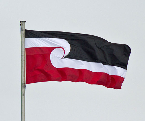
New Zealand has a rich cultural heritage. It is also a new and exciting place to live and work – multi-cultural, full of opportunity and natural beauty. A new New Zealand flag should be anything but standard, which is what the current shortlist looks like. Think about how exciting and different the Tino Rangatiratanga – the Māori flag – looks when proudly hoisted on Auckland”s Harbour Bridge on Waitangi Day.
Make me a flag
Gareth Morgan, the New Zealand millionaire businessman, economist, public commentator and philanthropist put his money where his mouth was and set up an alternative flag design competition, with a NZ$20,000 prize up for grabs. He is pro flag change and wanted to see a new flag that honoured the spirit of the Treaty of Waitangi – two partners agreeing to share this land and look after each other. His clear brief and panel of design professional judges attracted just under 1,000 entries from which a winner was selected. His hope was that the Flag Consideration Panel would look closely at the result of his competition.
Red Peak
Public support for a flag design called ‘Red Peak’ is currently gaining momentum. It has become the unofficial favourite in the last few days. This design was originally in The Long List but was discarded. It’s not hard to like. It looks like a flag, it stacks up well against other country flags and it speaks on many levels to the New Zealand story. Yes, it’s quite simple and abstract, but then most flags are the ultimate in less is more design.
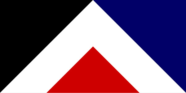
New designs of any sort sometimes take some getting used to. Red Peak grows on you, compared to the official shortlisted designs, which you feel you’ve seen before. One has even been compared to an upside down Weetbix pack. As you look at Red Peak, you feel rewarded when you understand what it symbolizes, followed by a sense of pride. And that’s got to be good for a nation’s flag.
I posted a screen shot of Red Peak yesterday on my Facebook page to get some comments from friends in the UK. Here’s a summary of what was said:
“Echo of Union Jack but in a less is more way”
“Black for NZ uniqueness”
“Optimistic and culturally symbolic icon or mountain”
“Cut price camping”
“Triangle denotes strength”
“A merge of colonial red, white and blue with Maori black”
“Semaphore / sailing flag”
“A koala experimenting with make up”
“A mountain”
“Multi cultures, mountains, volcanoes, sea, snow”
“Mountian, GB red, white and blue, Maori black”
What next?
If Red Peak or any other alternative designs are not added to the current shortlist, then the selection process will continue as planned. The highest ranked design from the referendum on the four alternatives will go head to head in a second binding referendum in March 2016. This will be the decider… keep the current flag or vote for the new one.
And for many who were initially pro flag change, this is now becoming the get out clause – their chance to state how disappointed they are in the new alternative flags by voting to keep the current one. The hope being that in another 10, 20, 50 years, we’ll do it right.
And that’s what I’ll be voting. Keep the current flag until a great one is designed.