Q: Can you create a brand that truly reflects our evolving business?
Angle: Rebranding with a breath of fresh air

After a few years in business, AirQuality needed to rebrand for 3 reasons and the management team felt that the timing was right – their startup had grown up.
Reason 1
Originally defined as a ‘comprehensive air quality measurement and monitoring service’ their offer had clearly broadened to include the monitoring of water, dust, vibration, odour and meteorological work.
Reason 2
New technology had a big part to play in their choice to rebrand. Rapidly increasing connectivity (the Internet of Things) and AirQuality’s ability to deploy appropriate network technology to monitor the environment, meant that they could connect decision makers with quality real-time data.
Reason 3
Strong links with universities and a unique set of skills among the AirQuality team meant an increasingly global client base and more international projects.
The creative brief was clear to us. The above 3 reasons made it obvious that we needed to create a new brand that truly reflected AirQuality’s evolving business and differentiate them from competitors through their unique offer.
Step 1 – Brand audit
We researched, analysed and presented an objective audit of the AirQuality brand and their competitors, to put things into context and establish a starting point. We looked for knowledge, opportunities and insights that informed the creative brief, the brand strategy and the creative process.
We reviewed 2 direct competitor brands and 12 indirect competitors. In our summary we felt that there was a sweet spot for a brand in their sector that sounded like a technology company but still had personality and wasn’t too dry and complex. We also saw an opportunity for a strong brand name that didn’t narrow their field of expertise.
Step 2 – Brand strategy
We facilitated a brand workshop with the client team. By asking the right questions and prompting people to think about their business from a different perspective, we ‘drilled down’ to find out what was unique about their organisation and how it behaved. We also interviewed 3 current AirQuality clients for their first-hand knowledge.
We presented our findings as a brand definition document, which clearly articulated: brand positioning, mission, vision, a value proposition, brand values, personality and the brand essence.
We saw a highly innovative and connected business that provided data to solve problems.
Step 3 – Brand naming
Having the right brand name is a critical brand asset. At this stage of the rebrand we helped AirQuality to see the value in a name change and presented multiple possible names. We brainstormed, researched, created shortlists and presented our thinking until the right name came along: Mote.
A mote is a small particle. A mote is also a sensor node – a connection point in a sensor network that is capable of performing some processing, gathering sensory information and communicating with other connected nodes in the network.
Step 4 – Brand identity
With our clearly articulated brand strategy to guide us, we designed exactly the right combination of visual and verbal assets to make up the revised brand identity. The Mote ‘brand toolbox’ covered 6 brand assets:
• Logo design
• Colour
• Typography
• Imagery
• Graphic elements
• Language
We created a distinctive rebrand that had the ability to tell Mote’s full story with relevance and personality.
Step 5 Brand guidelines
For Mote to keep their brand knowledge in one place and to protect their brand IP, we document strategic and creative brand information in a simple to follow brand guidelines document.
We find that this user-friendly reference document helps to maintain brand consistency, by explaining to staff and suppliers how to use the brand assets correctly.
As with most of our branding projects, we tackled the logo design first but never in isolation. A brand is much more than just a logo. When we came close to completing the new logo artwork, we had already started exploring and designing the new brand identity, so that all the components would work effectively together to convey the right messages and personality.
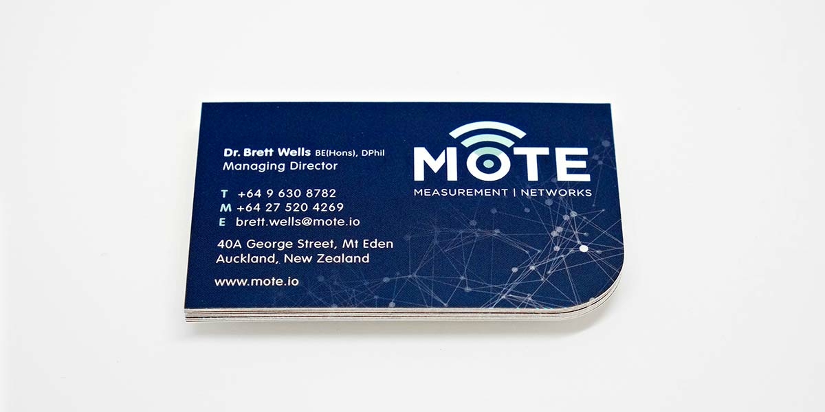
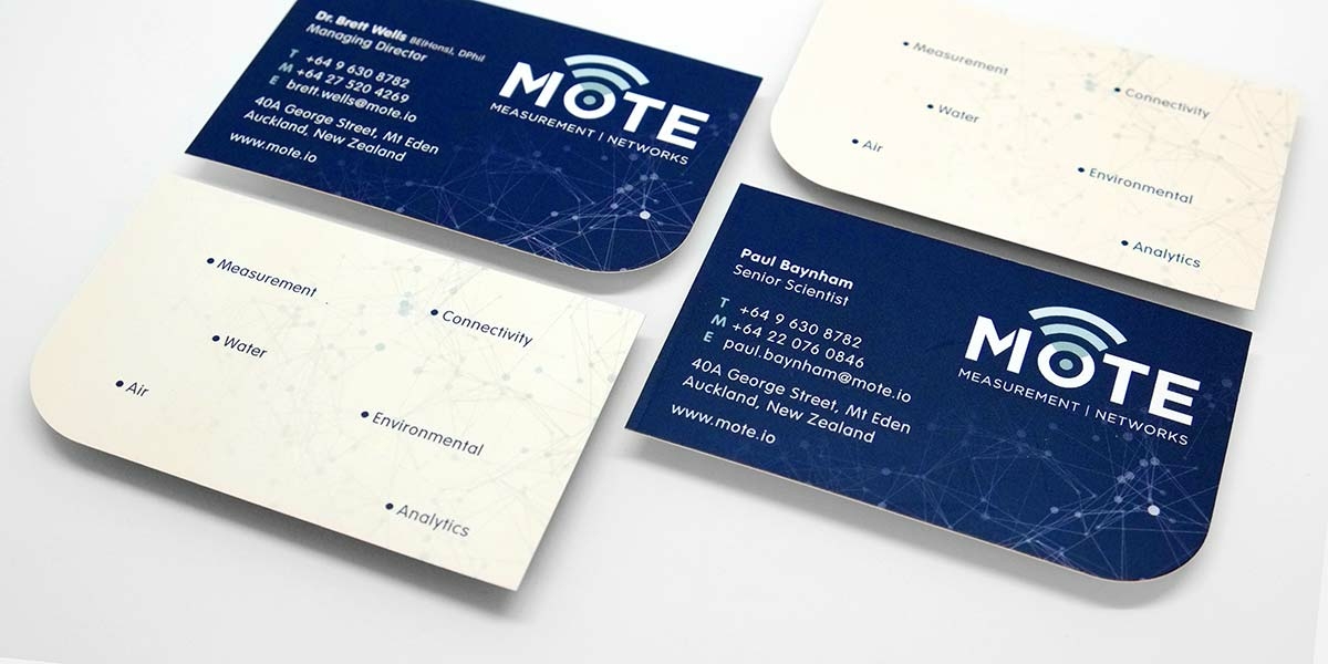
Connectivity is a key message from the name and the logo design. The dot in the letter O represents a speck or tiny particle and a WiFi-like symbol radiates from it. A small gap in the right hand leg of the letter M means that the M is still obvious but a more subtle letter ‘I’ becomes visible and the letters ‘IOT’ can also be distinguished in the middle of the name (Internet of Things).
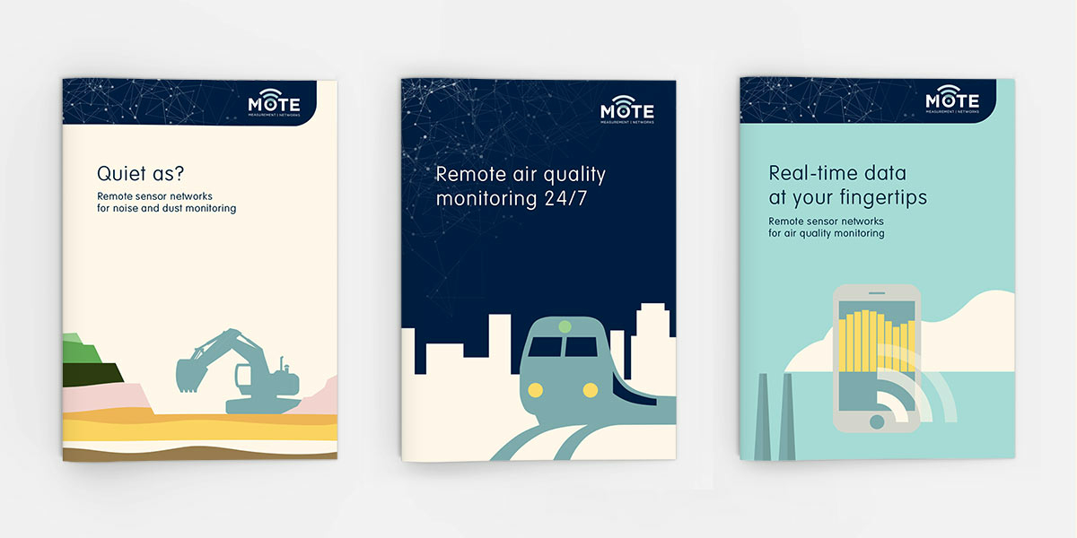
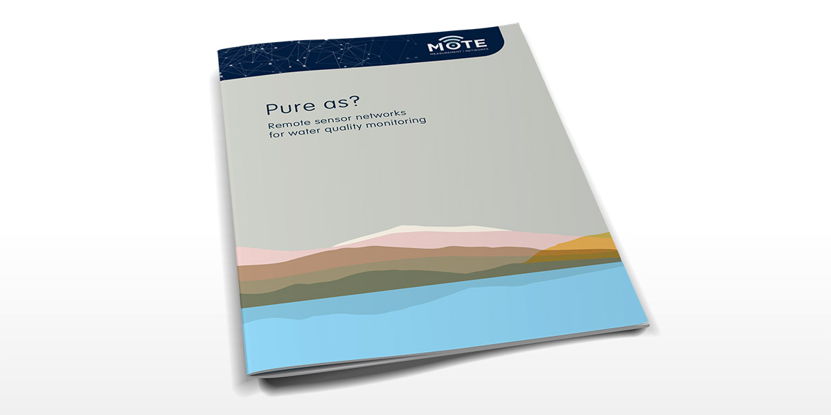
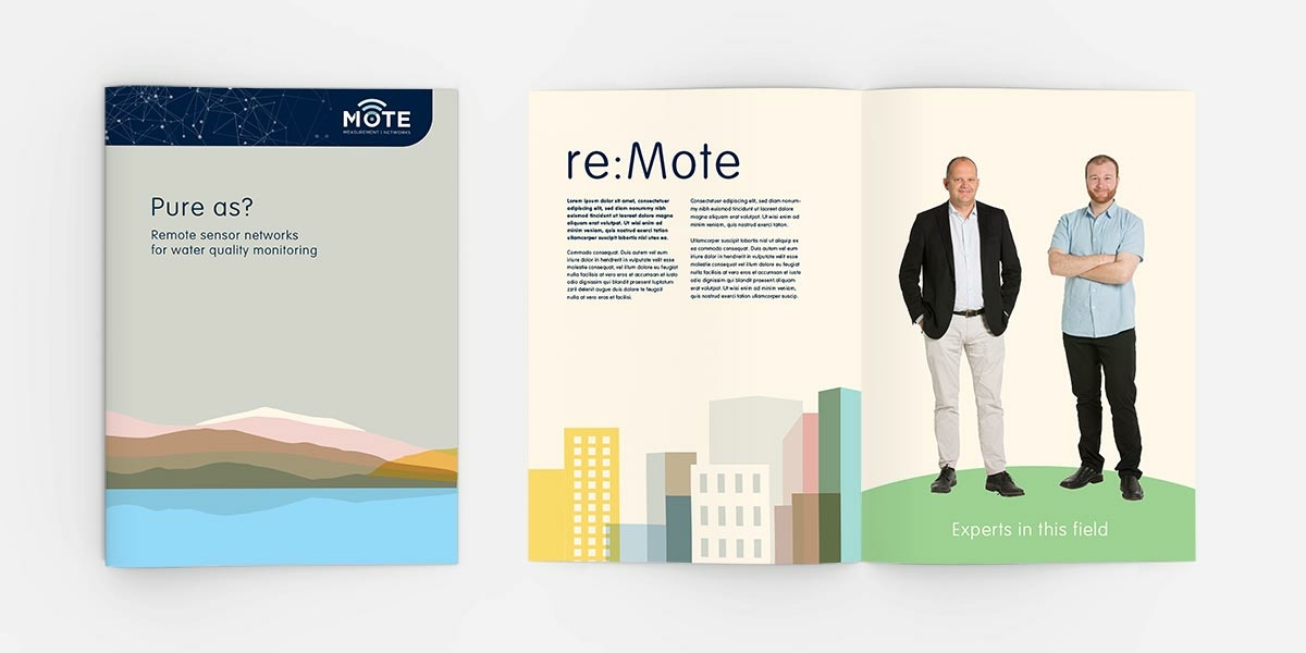
Map-like colours play a key role in the rebrand. They suggest different geographic locations and an international flavour, while reflecting the natural and urban environment. The slightly muted tones are fresh, clean and distinctive in this sector.
A suite of flat colour, vector illustrations really sets Mote apart from its competitors, who mostly use conventional photography and typical environmental images which don’t feel unique.
A flexible ‘network graphic’ of interconnected nodes (or motes) adds texture and meaning into the mix. Clean, minimal typography and a less is more approach to writing with an appropriate tone of voice, completes the rebrand.
This is our opportunity to work with Mote and launch their brand. A staged approach has been taken and the following jobs have been done:
• Business cards designed and printed
• Initial brochure designs created
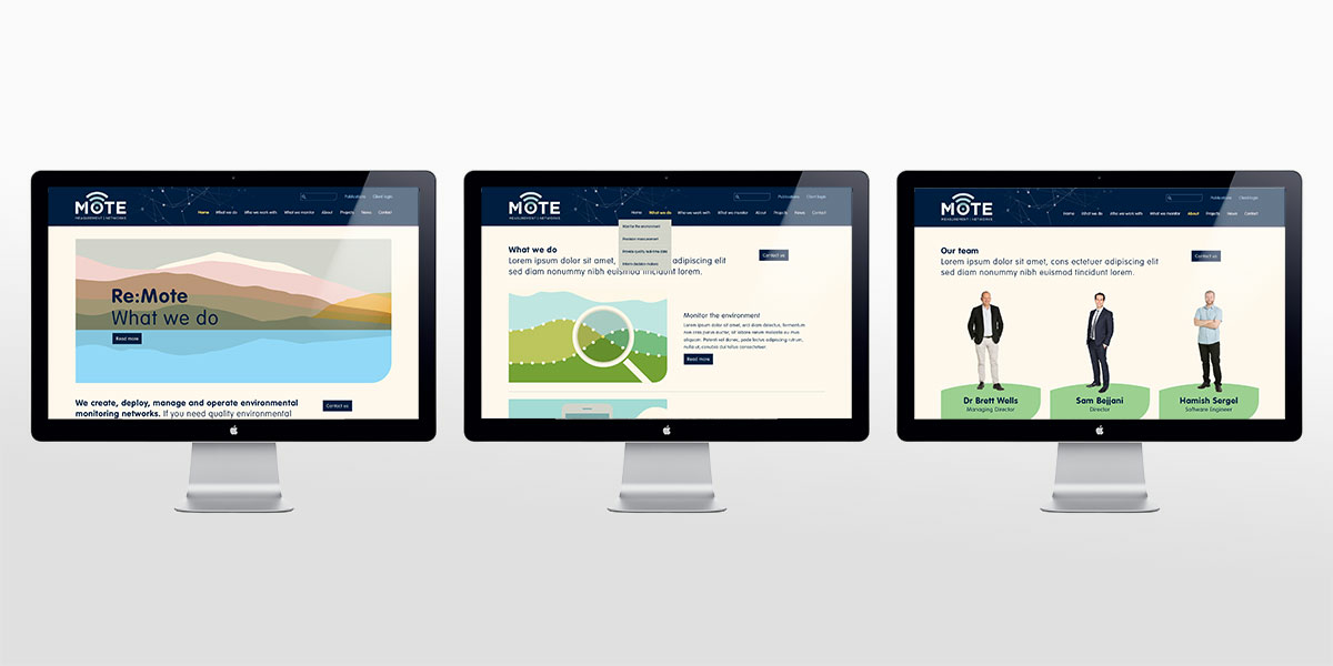
• Responsive website in development
• 23 unique illustrations created
• Photo shoot of all Mote staff
Do you need help with branding a company, product, service, or experience but you’re not sure where to start? Do you want your brand to stand out, build loyal customers and thrive? Find out about our branding services and how we use branding as a powerful business tool or contact us, we’re experts with a down to earth approach.
| Date | April 2017 |
| Categories | |
| Client | Mote (previously AirQuality) |
| Country | New Zealand |